Shelf
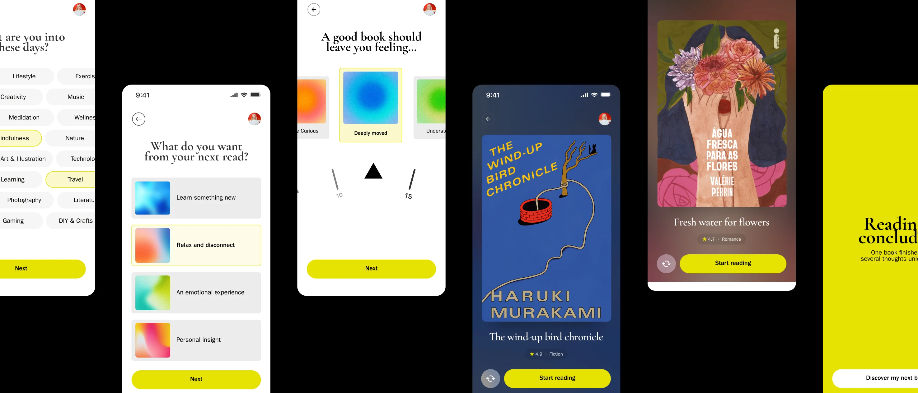
One book at a time, chosen by mood, not another endless catalogue.
Less choice,more reading
Context
Shelf came to the team with its name and theme already defined: a book-focused app created as our final project for a Digital Product Design course.
What the product actually did, however, was still a mystery.
Our first two hypotheses never made it past the concept stage.
- A book club
- A “bookshelf” app with a social network for readers
A book club raised operational questions without clear answers. A “bookshelf” app with a social network for readers seemed relevant, but it didn’t solve a specific pain point: it simply added another layer to an already crowded catalog of options.
The question was simple to ask and difficult to answer:
Within the world of books, what is the actual problem worth solving?
Insight
We decided to spend more time researching before attempting a third idea.
After many hours on TikTok and YouTube, I came across psychologist Barry Schwartz’s concept of the Paradox of Choice: having too many options doesn’t necessarily make decisions easier. Instead, it increases cognitive load and uncertainty.
That was the moment when our two previous attempts started to make sense in retrospect.
The book club and the social bookshelf were both ways of adding more things to a problem that actually called for the opposite.
Benchmark
We looked at existing products in the book discovery space to understand whether this problem had already been solved.
It hadn’t: it was simply being organized in different ways.
Goodreads
Focus
- Cataloging
- Community
The catch
An almost endless catalog, with information competing for attention.
The StoryGraph
Focus
- Mood
- Reading pace
The catch
It relies on filters, so users still decide across multiple variables.
Likewise
Focus
- Interests
The catch
Books, movies, TV shows and podcasts mixed together dilute the experience.
None of these products remove the choice itself. They simply change the way it is presented.
That opened up the opportunity for Shelf:
Instead of organizing more options, what if we eliminated the need to choose between several of them at once?
Key decision
I proposed turning Shelf into a personalized curation experience.
A guided questionnaire would understand the user’s current mood and preferences, then recommend
one book at a time, not a list, not a catalog.
- Answer the questionnaire
- Read the book
- Mark it as completed
The user reads the book, marks it as completed, and the journey starts again, with the app becoming slightly more calibrated based on their experience with the previous recommendation.
This decision simplified everything.
The entire team now had a single core flow to design around, instead of negotiating between competing features.
It was the moment when the project stopped being “an app about books” and became a product with a clear thesis.
My approach
UX: Designing the flow
I started with the questionnaire, the entry point to the entire experience.
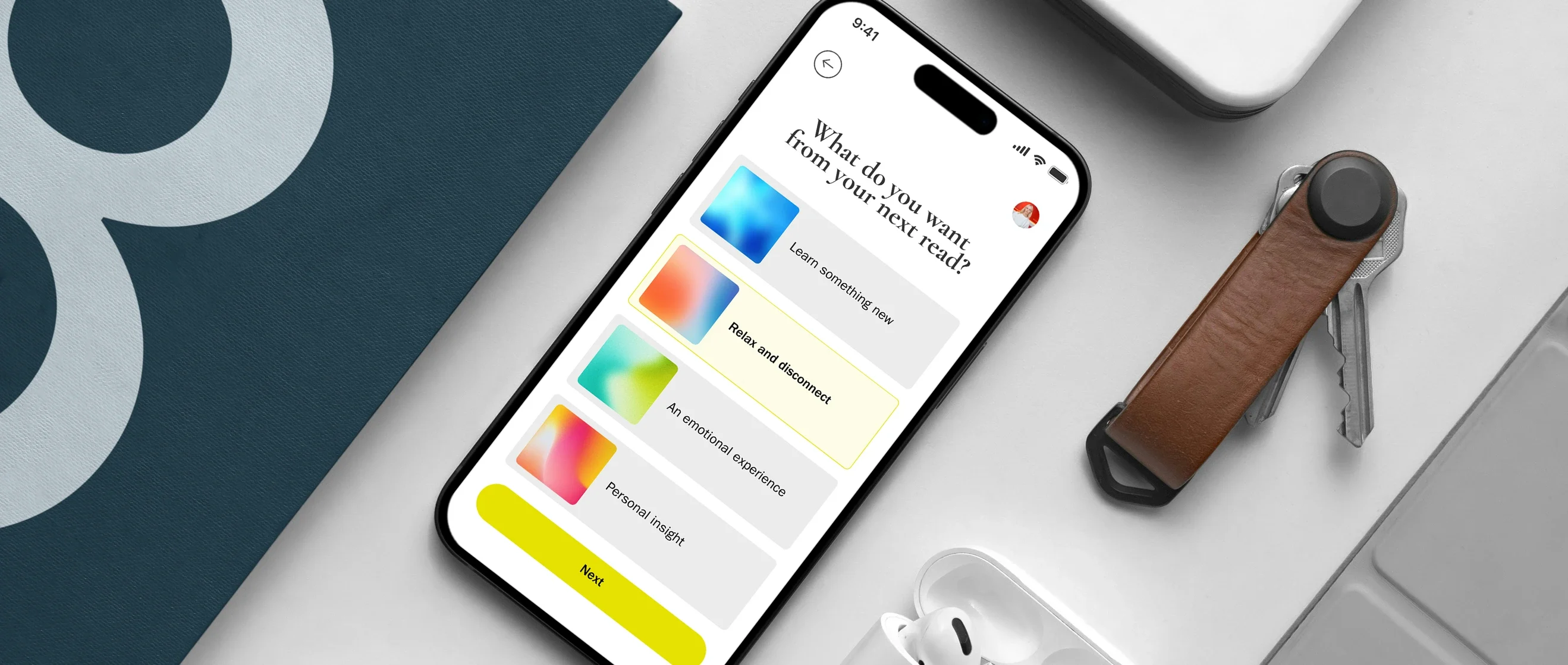
I designed the screens as a funnel: they begin with multiple possibilities and gradually narrow down with each answer.
The questions weren’t about literary genres.
They focused on the emotional state the user is in and the emotional state they want to reach through reading.
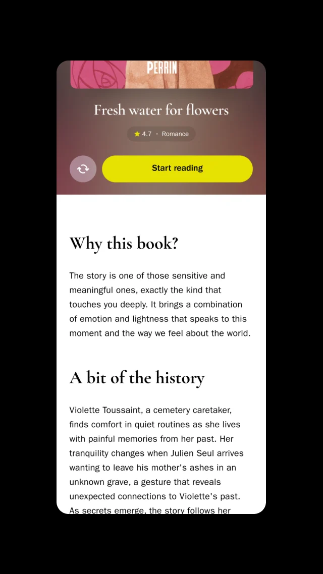
Each recommendation also comes with an explanation of why that particular book was chosen, so the recommendation never feels arbitrary.
UI: Finding the visual language
This was the part where I got the most things wrong before getting them right.
I wanted the interface to communicate emotion and energy, so I initially experimented with images and illustrations. But both approaches represented emotional states too literally.
An illustration of “nostalgia” or “energy” inevitably becomes a specific scene.
The experience I was trying to create was more subjective, closer to a feeling than a visual narrative.
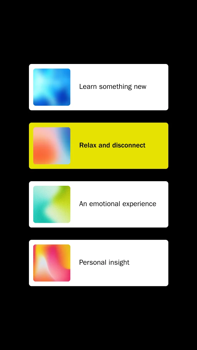
The solution was to replace imagery with color gradients.
Gradients could communicate mood without illustrating it, leaving space for each person to attach their own meaning and emotion to the experience.
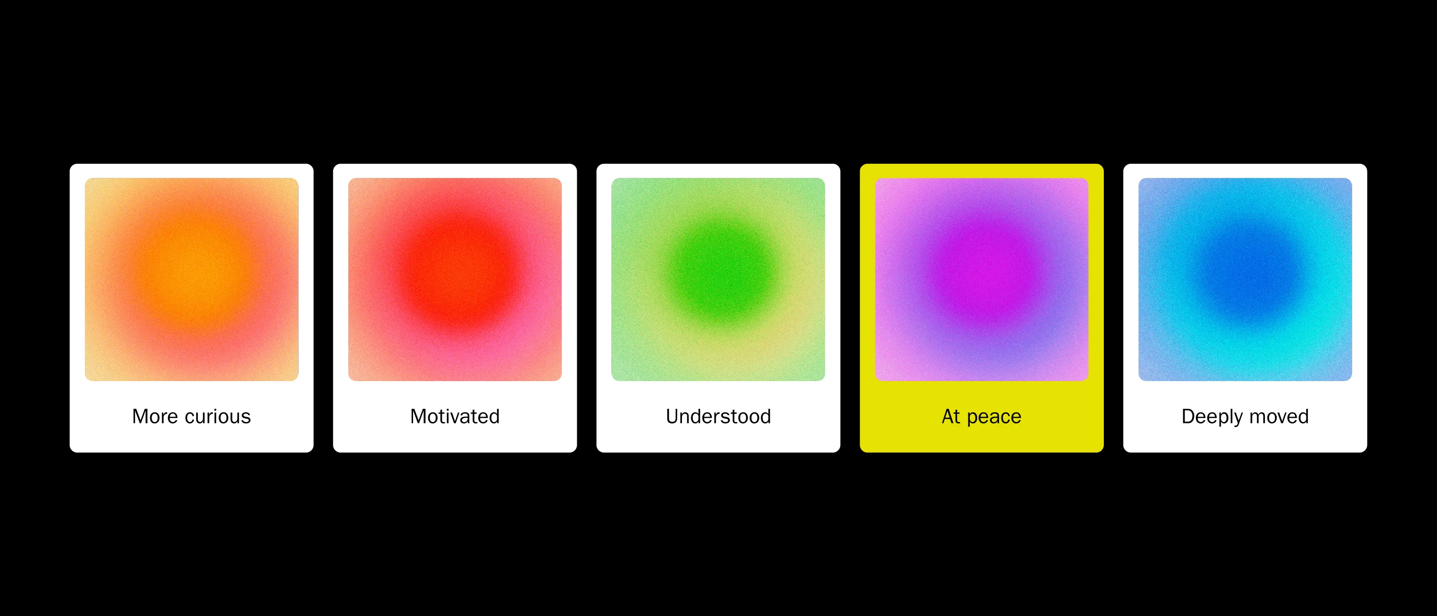
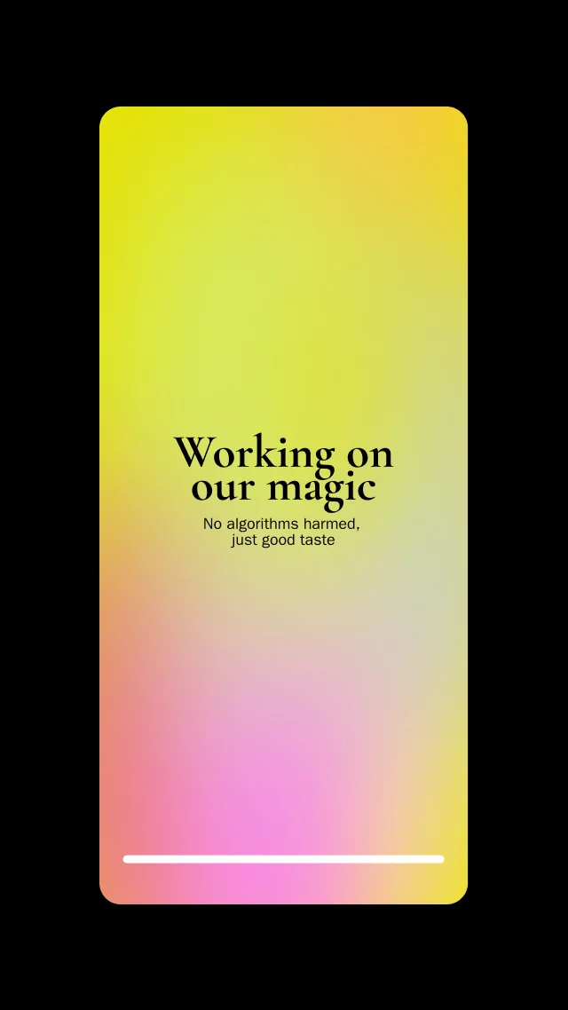
I reused the same visual element on the loading screen between the end of the questionnaire and the recommendation, creating a cohesive emotional language throughout this part of the journey.
I was responsible for the visuals across the entire questionnaire experience, as well as the complete prototyping of the app.
Result
Shelf evolved from two attempts without a clear direction into a product built around a simple, defensible thesis:
Fewer options, delivered with more context, can lead to more reading, not less.
One-book-at-a-time curation, guided by an emotional questionnaire and expressed through a visual identity that doesn’t try to illustrate feelings, but rather suggest a sensation, became our response to the gap we identified in the existing market.