Aura
Replacing the map with the camera, so travellers stop translating and start walking.
Airport navigationwithout the cognitive load
Context
The brief was simple to write and impossible to solve: “Design an app to help people navigate airports.”
Four people, working as a team, with no defined scope.
An airport is
- Logistics
- Shopping
- Food
- Boarding
- Connections
- Baggage
Each of these could easily become an entire product on its own. Our first job wasn’t to design anything: it was to figure out
which part of this problem was actually worth solving.
We looked into wayfinding research to understand where the real pain point was. A recurring pattern emerged: the problem wasn’t necessarily a lack of signs or maps.
It was cognitive load under pressure: complex layouts, limited time, nervousness, and the natural difficulty of building a mental map of an environment you’ve never experienced before.
Hypothesis
With that mapped out, we faced a difficult question: which moment of the airport journey should we tackle first?
The answer wasn’t “let’s solve everything.” It was about cutting the scope down until only the essential remained:
the journey to the boarding gate
the moment when
- Time is limited
- Mistakes have real consequences (missing a flight)
- Anxiety is at its peak
Our hypothesis was simple:
if we could eliminate the need to interpret information (reading a map, decoding signs, translating a 2D representation into the real world), we could reduce a significant part of the stress associated with navigation.
That translation between the map and the physical environment is exactly where confusion and mistakes happen.
If we solved this one part well, the rest of the product could grow from there. If we tried to solve everything at once, we would probably solve nothing particularly well.
Key decision
The central decision of the project was to replace the map with the camera.
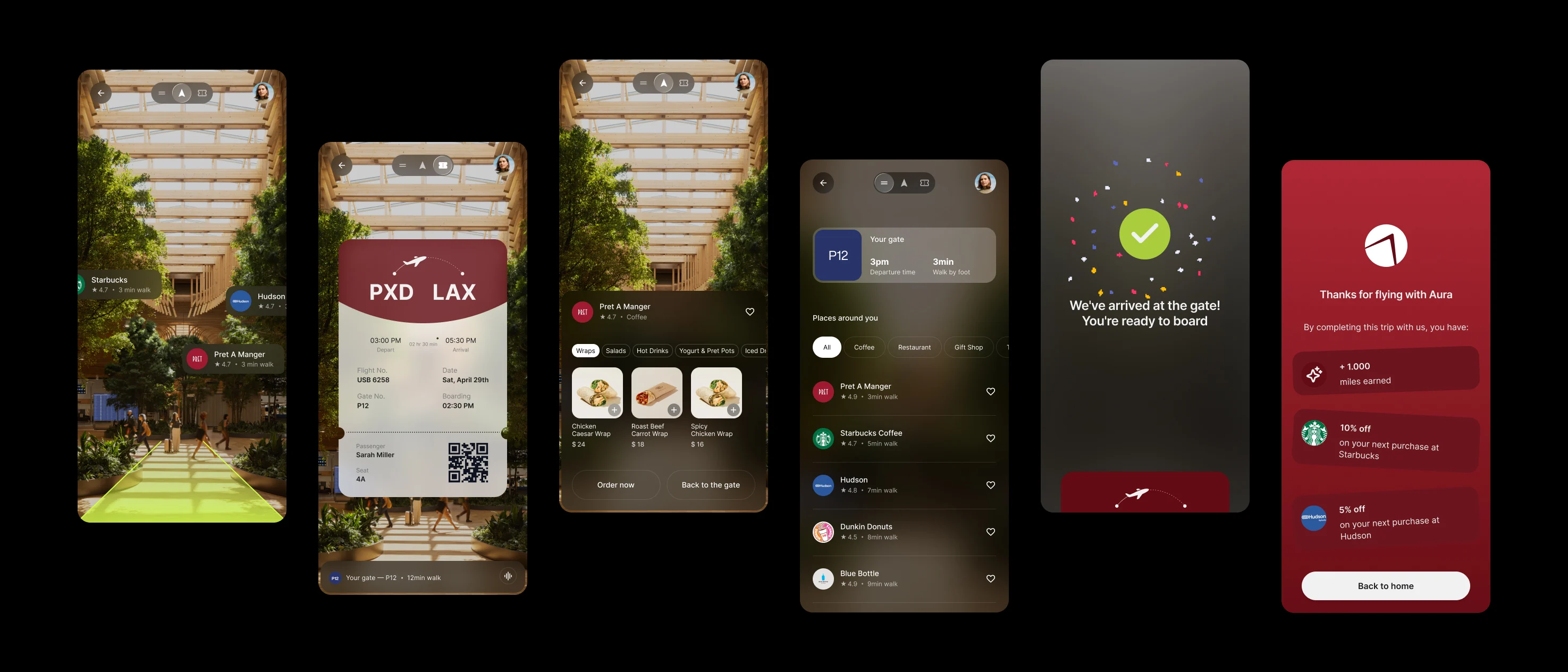
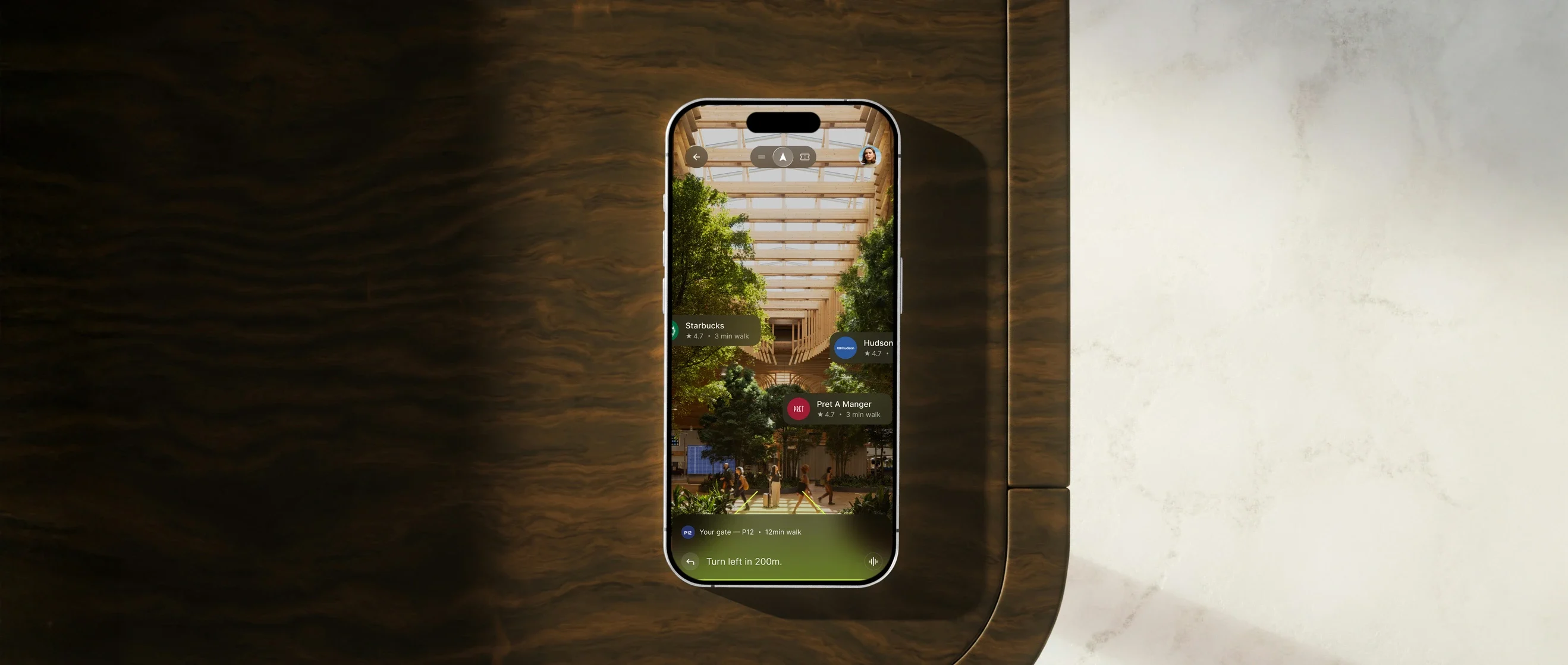
Instead of showing an abstract representation of the airport, Aura opens the phone’s camera and overlays the route, in neon green, directly onto the real environment.
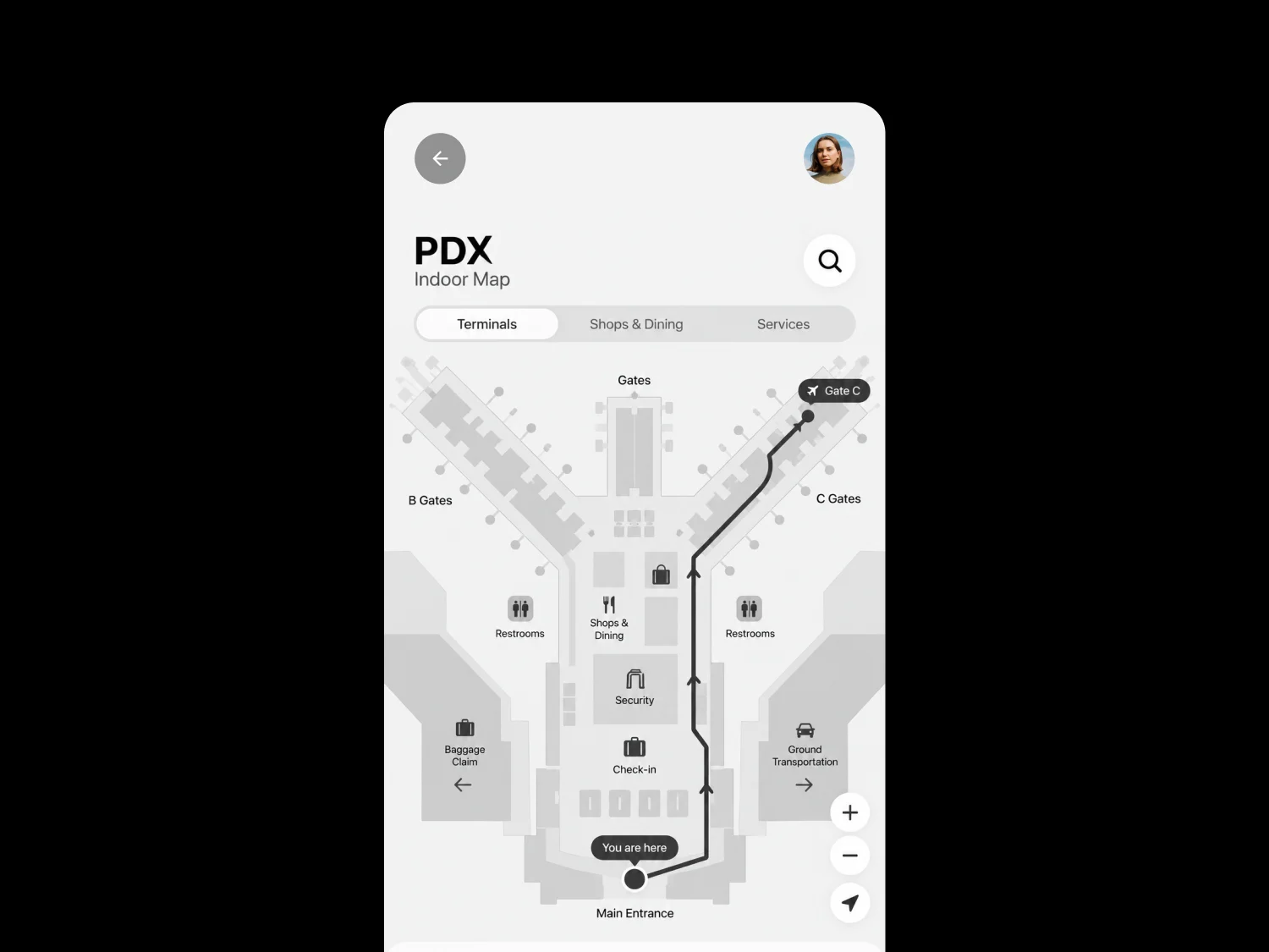
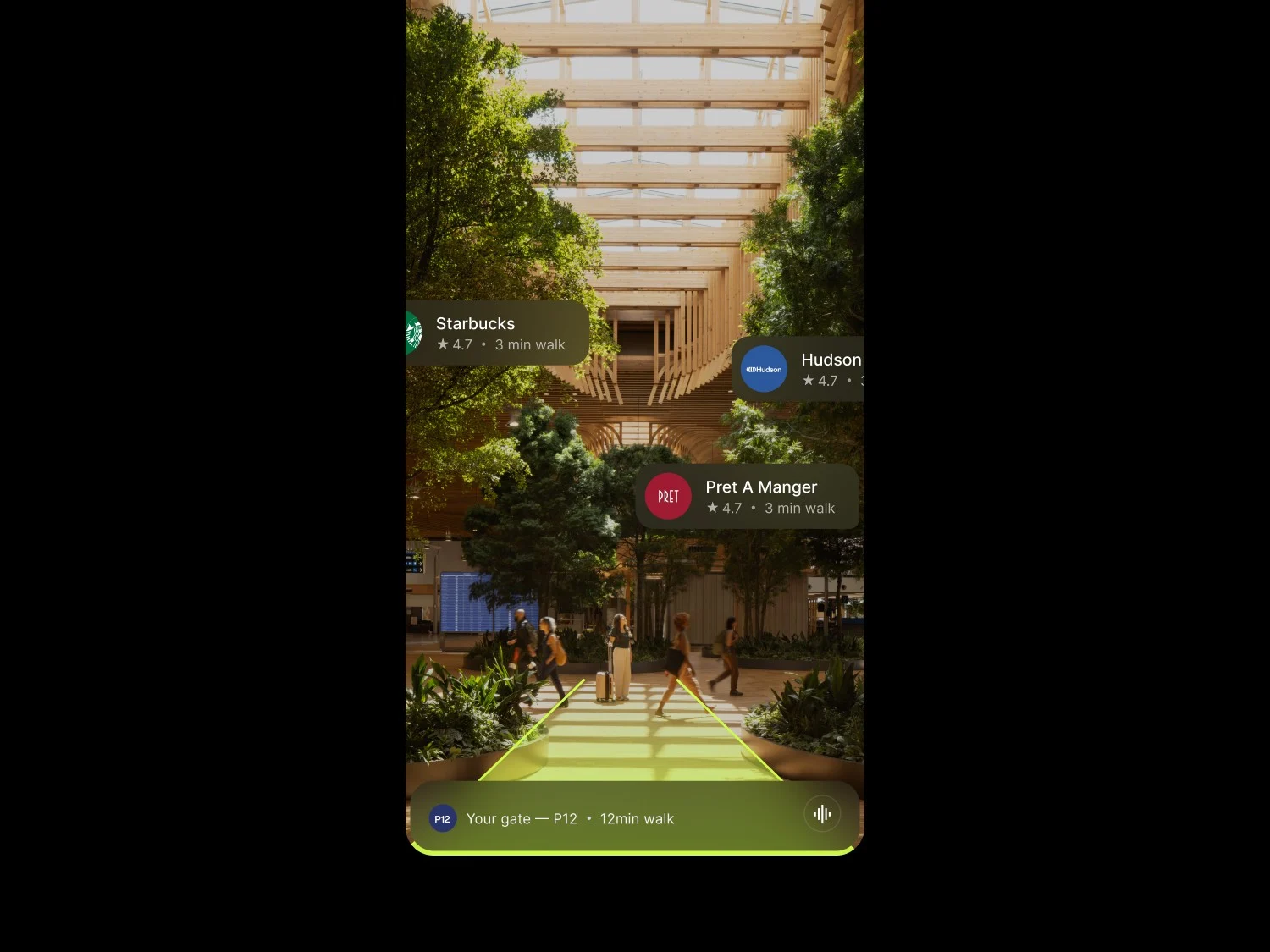
The user doesn’t need to understand where they are on a map.
They simply follow the line on the screen, exactly as they see the corridor in front of them.
This real-time, camera-based navigation became the core of the product, and it was the first thing we validated before making any other product decisions.
The layers that came afterwards
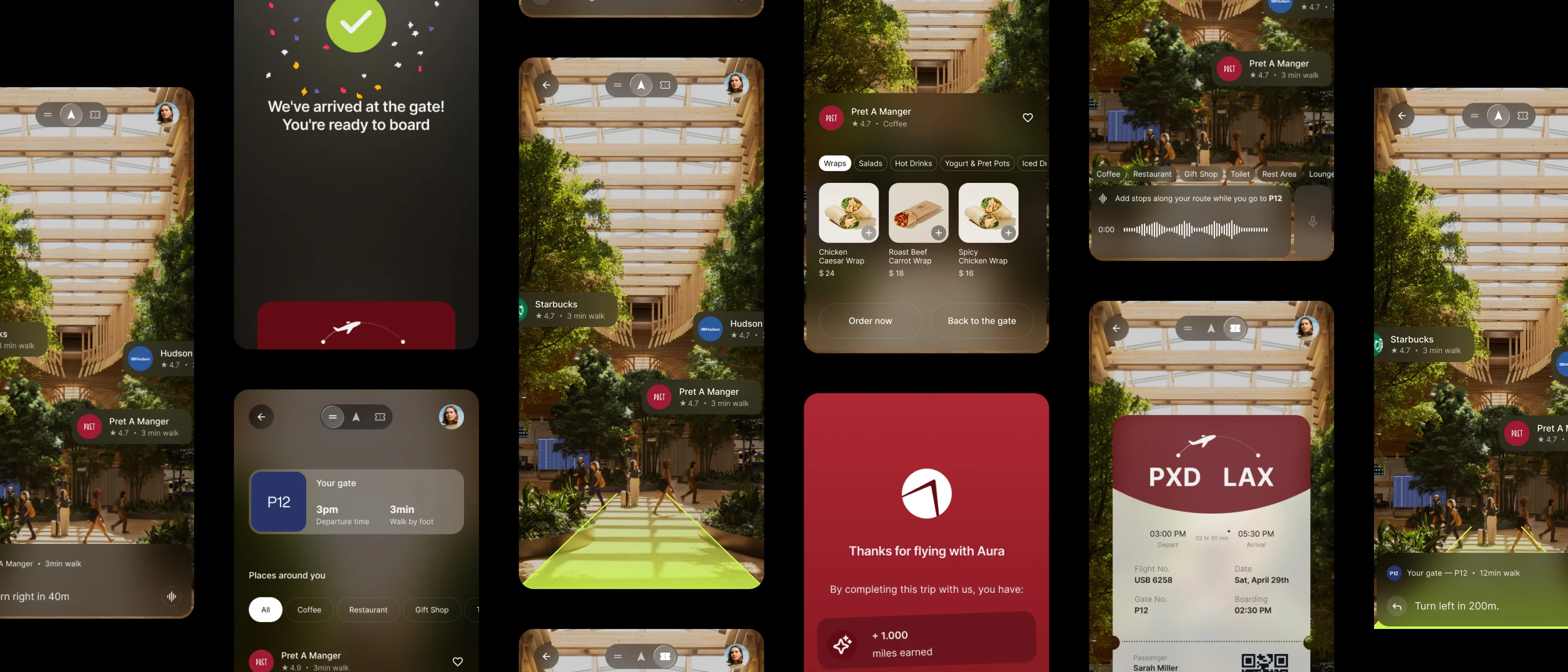
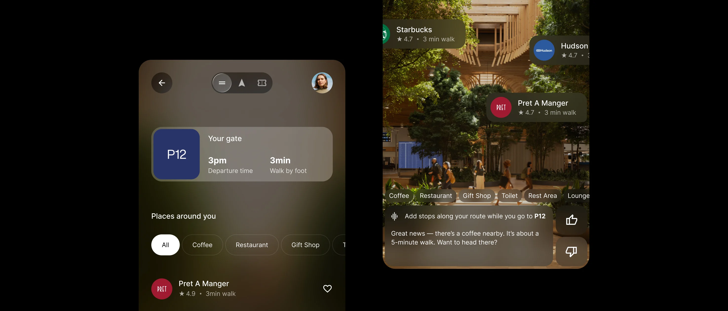
- An integrated boarding pass
- Points of interest along the route
- Voice commands
- Smart time alerts
weren’t added just to complete a feature checklist.
Each one addressed a specific friction point identified during interviews, and all of them were designed not to compete with the one thing that truly matters on this screen:
the green line guiding the user forward.
My approach
UX: An information-heavy interface
My main contribution to the project was
- UX thinking
- UI direction
While the team divided the work across different parts of the product, I led the core visual decisions and prototyped the entire app.
The most important decision I made in this area was how to visually handle an interface that is inherently information-heavy:
- An open camera view
- An overlaid route
- Points of interest
- A boarding pass
- Alerts
all competing for attention while the user is simply trying not to miss their flight.
UI: Hierarchy without color
My approach was not to create hierarchy through a wide color palette.
Instead, I used blur and transparency to establish visual hierarchy. Secondary elements become faded and translucent until the moment the user needs them, while the neon-green route remains the only element with full contrast on screen.
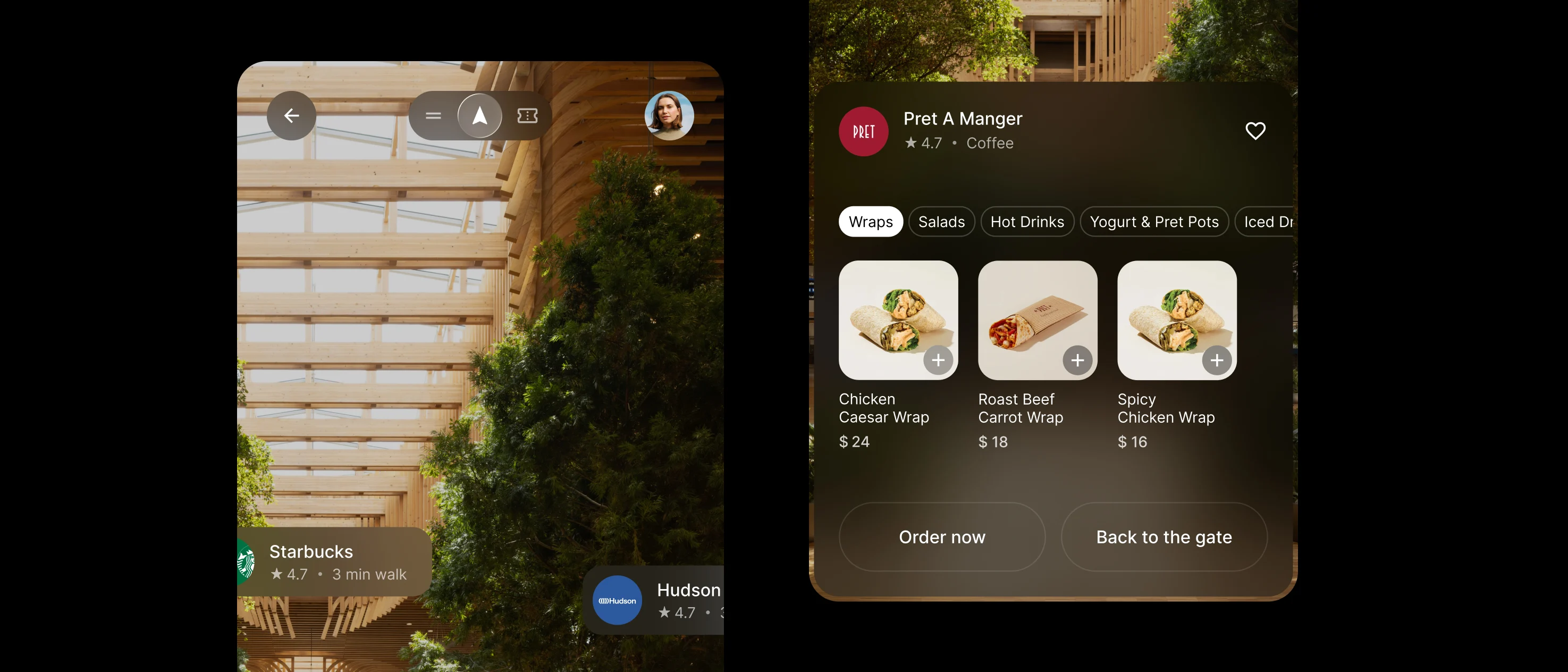
This wasn’t an aesthetic choice for its own sake. It was a direct response to the problem that defined the project from the beginning.
A broader, more colorful palette would have done the exact opposite of what Aura was designed to achieve:
reduce cognitive load in a high-pressure environment.
Result
Aura started with a completely open-ended brief and became a focused product because the team was willing to cut scope before building.
Camera-based navigation addressed the core problem, and every layer added afterwards followed the same question:
Does this help or get in the way of the moment of pressure we’re trying to reduce?
That thread, from narrowing the problem to making the final visual decisions, guided the project from beginning to end.